Promoting new, innovative applications / processes is challenging. There are always opportunities for spin (sometimes from competition, sometimes from media); furthermore, there is difficulty in communicating a highly technical design (code, UI, and database) in common easy to understand terms.
Frequently use analogies to help an audience understand the learning labels system. To appreciate the uniformity and readability of the pure learning label representation, I compare learning labels to nutritional labels. Are they the same? Is that where the inspiration started?
No, I am just refering to the actual display of a label. The system manages and tracks skills, subject of a paperback book and three filed patent applications.
No, I was working on a skills tasking application and wanted reduce data entry. This is a good article on the seeding of the concept: Syracuse University Article.
Some of my other analogies:
"Map learning expectations and job requirements to skills and Skill Points ® like mapping atoms and coefficients to substances.”
"Skills are the language of learning."
"Skills are the verb of knowledge".
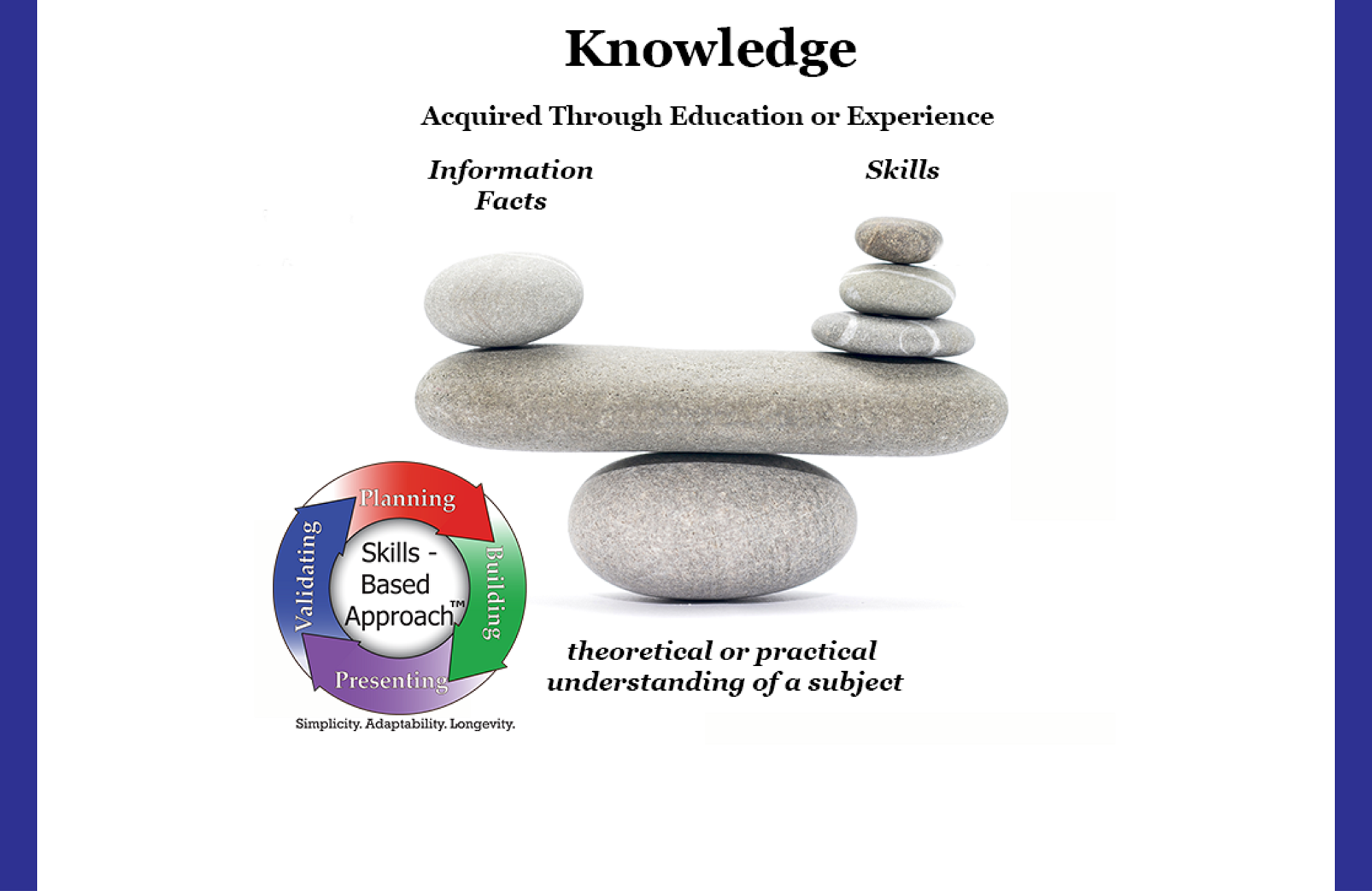
Can you really do this (there is so much more to learning)? What about subjects and domain knowledge?
Yes, in ten years of working with skills, I get more and more confident this works and prove so with the system I created. The system includes a definition (in skills) and quantifying (in Skill Points ®) process. Other fields capture subject / discipline and domain knowledge. Designating and representing education and training standards anchor the expectations. A peer review process verifies the accuracy.
Clearly, such a focus on skills is different than the centuries old learning paradigm focused on subject matter. Apprenticeships are ancient, though traditionally for skilled trades. Obviously forming perspectives is always relevant, though future technology augments our ability to retrieve facts and information.
I propose taking an expansive skills perspective by including not only technical but also soft and thinking skills and be conscientous and 'in the moment' to apply them properly in our experiences.
I just released five Google Android and two Windows 10 applications (which coincides with a substancial website application) I am looking to get feedback on the user interface. Is this all the system does? Are there other companies doing something similar?
No, I designed the mobile application to be as simple as possible. Requires a single page load, very legible, and addresses specific purposes. As said earlier, there is so much more depth to the system.
When you find large reputable companies doing similar work (on some level), you know you are doing something right. This unequivocally proves the relevancy and value of that feature. Three patent applications in 2016 and 2017 cement being a 'first mover'.
